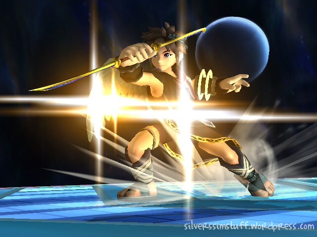
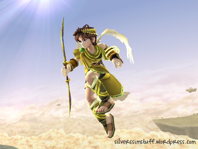
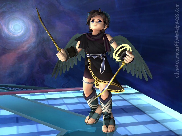
This guy is so freaking brilliant
Why they're not using his awesome Brawl design and making him look like a western emo Star Wars character is beyond me. FFS. Things don't need to be dark to look cool, any of those Pit designs are using the Brawl design but making him look needlessly emo/darker, or too much like an adult. The game is called KID Icarus for a reason, Pit is an adolescent!!
Creating Pit like this will not bode well for Japanese sales, neither does Factor 5. I know it never did so well in Japan anyway, but his Brawl look is amazingly popular now. By doing this they instantly take away any popularity potential.
Angst is the total polar opposite of good. He looks like f***ing Anakin Skywalker with wings!
I don't care if it's concept art, if they had any brains they'd use his popular Brawl look, no redesign needed, that was already done.
EDIT: Oh, and the story of Pit as a fallen angel is total bulls**t. I hope it's not real. It's the total opposite of the way Pit is usually imagined. Why does everything have to be all dark and angsty these days!?
Continue reading

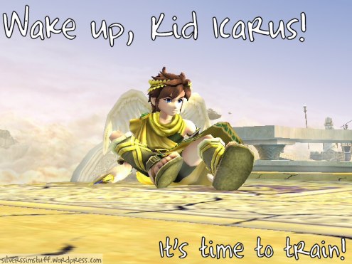


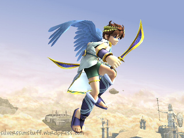
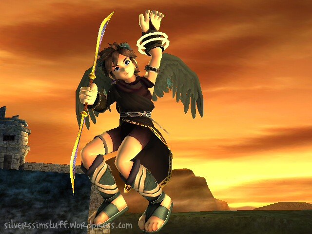
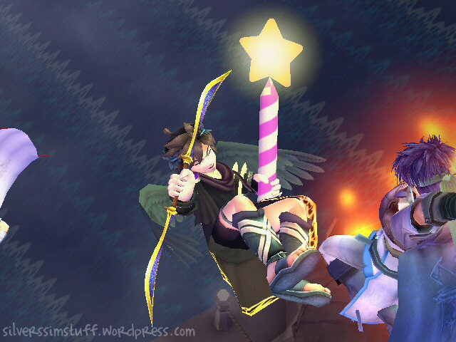

 The pics look better on the TV screen, they look very pixelated here though 🙁 For some reason the pics are anti-aliased on the Wii, but not when transferred to PC. I don't get it [Edit: you moron. It's because the game is rendering the 3D models, but the JPEGs are like thumbnails]. Click to view full size